Neutral Earth Tone Tiles To Match Pumpkin Spice Latte Season
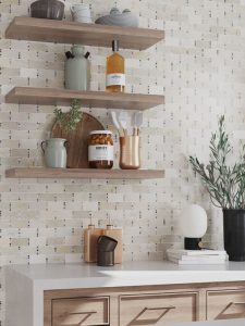
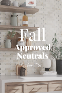
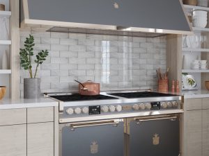
Chic neutral earth tone tiles (Alicante) create a covetable aesthetic in the modern farmhouse kitchen design above.
Neutrals. Many of us still think that the term neutral interiors is a breeding ground for dull, lifelessness design. This couldn’t be further from the truth. In recent years, thanks to tile printing advancements and stylistic changes, the use of neutral tiles and neutral home decor has made an everlasting positive impact on interior home design. With myriad shades available (goodbye, grandma’s favorite beige) to multidimensional textures…Neutral earth tone interiors are all the rage and a must-use now that it’s fall. After all, nothing quite beats cozying up with a pumpkin spice latte than being surrounded by crisp white knits, sandy beige tiled walls and wood look porcelain floors.
What’s Considered Neutral Color Tones In A Design?
Okay, so if neutral interiors aren’t just that plain, drab beiges that hurt your eyes…What exactly is it?
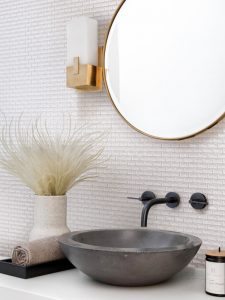
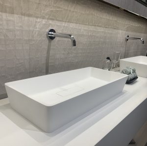
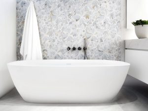
Light and bright powder room with a shimmering brick white mosaic tile (Glacier Brick) on the walls.
Neutral earth tone tiles or neutral interiors in general, can be defined as soothing, chic hues that can be found in nature. While there are nearly more color shades than we can label in a sitting (we’re not Pantone, after all!), a great overview and understanding of what these neutral colors are is as follows: sandy beige, light gray, moody gray, muted black, muted greens, navy blues, sky blues, browns, crisp whites, off-whites, ivory, or taupe.
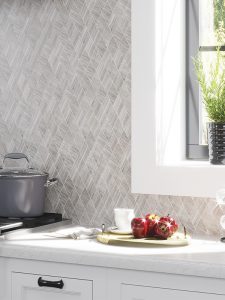
Fabulous diamond wood look tiles (Savannah Avalon) craft a neutral interior kitchen.
In sum, these colors are known to evoke feelings of the natural world. Think sand dunes in late summer, with mixed hues of dark and light from early morning mists. Or, mountaintop clouds gathering together to craft moody, gray skylines. The essence of nature is that it provides a blank slate for creation, such is the case for neutral earth tone tiles in interior design, too. They can drive home an overwhelming sense of grounded reassurance in a residential interior that is felt by all.
How Can A Home Benefit From Using Neutral Earth Tones?
When it comes to designing with neutral earth tone tiles, there are limitless benefits to be had. While this may seem surprising since, well, it’s not a flashy metallic statement tile or a pearl-infused marble feature wall tile, these soothing tiles do have some tricks up their sleeve. We promise as an interior designer or DIYer, you’ll be fond of them.
Seasonal Transitions Made Easy
Using our Silver White 3×9 glass subway tile, this design found a perfect balance between light and dark to create a stunning result.
If there’s one thing that neutral interiors can provide, along with neutral earth tone tiles, it’s that they offer easy seasonal transitions. Thanks to their subtle facades and calming aesthetics, it’s pretty easy to switch between summer and fall on a dime. In the summer, it’s easy to bring out a light, airy aesthetic to match white subway tile backsplashes or pattern marble bathroom floors by incorporating breezy linens, shell decor and coastal scented candles. Alternatively, when the temperatures drop and fall shows its face, moving to a more autumnal vibe is just as simple; throw a few pumpkins on a mantle that seamlessly match a neutral tiled fireplace surround and place deep orange knitted throw blankets on a living room sofa.
Soothing Aesthetics That Last
Unique textured porcelain tile (Jumanji Pearl Textures Deco) makes a splash in this contemporary styled powder room.
While bright colors do have their place in many designs, in transitional homes, modern farmhouse homes and some contemporary homes, neutral earth tone tiles are a hit thanks to their ability to craft a soothing atmosphere. These tiles, used on backsplashes, feature walls or accent walls, craft a steady, serene environment for inhabitants. Additionally, these muted hues can allow a space to feel more open, welcoming and bright. All positive reinforcements of a great design.
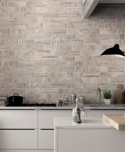
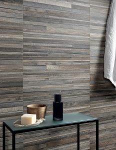
Cozy and soothing brick style wood look tiles (Urbana Brick Natural) in a modern industrial kitchen.
So, whether you’re seeking to make your clients home farmhouse chic with a wood look mosaic backsplash tile or take things in a more cozy direction, and craft a moody, Scandinavian living room with a gray tile feature wall, there’s never a better match than neutral tiles for the project! They will add ease, depth and dimension in a heartbeat.
Patterns, Textures, and Wood Looks, Oh My!
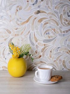
Calacatta gold waterjet backsplash tile (Sofia) creates a swirling, dimensional design in this kitchen.
If there ever was an interior design style that is meant to be played up with patterns, textures and dimensions, it’s neutral. Unlike bright, bold looks, neutral interiors get away with layering patterns, stacking textures and making a medley of tile designs. The reason is simple: The color tones play off one another, less likely to clash, and create a loud dynamic that’s unappealing. Such is the case with pattern tiles. Using pattern wall tiles or floor tiles in a kitchen or bathroom neutral interior design gives visual interest and a glorious touch.
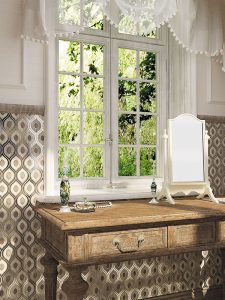
Creating a bold floral tile (Himiko) display feature wall ideal for this lux bathroom design.
You can use pattern marble tiles made with calacatta gold (like the above) that gives naturally occurring variations to make a neutral space anything but dull. On another hand, you can create a mixed material aesthetic behind a tub with a feature wall made from neutral terrazzo look ceramic tiles. The options are endless.
Rustic farmhouse interior with wood look tile walls (Oregon Agata Deco).
While pattern tiles have their place in neutral interiors, another benefit of using neutral earth tone tiles in the home is that you can get away with some seriously unique wood look tile concepts. While there may be cause for overwhelm in most designs, if wood was overused, neutral interiors crave the material. For example, making a rustic farmhouse design calls for textural surfaces, dark neutral tones and variations for imperfect touches. What’s better than wood look porcelain tiles on walls and floors? A floor-to-ceiling tile situation not only embraces the core essence of neutral interiors but makes a cozy, homey design that is adored. (Oh and no, it won’t be too much brown either, thanks to the intended color variations made during printing on the porcelain tiles.)
What Are Some Ways To Incorporate Neutral Wall or Floor Tiles Into Design?
Just when you thought we provided you all that’s needed to go on your way and form a covetable, understated neutral tile bathroom or curated neutral living room, we’re here to give you even more. Below are several awe-inspiring neutral earth tone tiles from the MIR collection that when used in tandem with neutral, made a gorgeous design. Scroll on and be inspired.
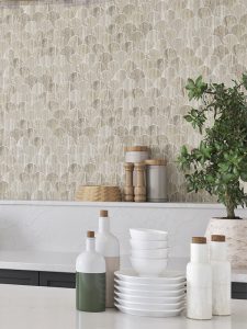
A modern farmhouse kitchen with neutral earth tone fish scale mosaic tiles (Cloverdale) that give textural support.
Fish scale mosaic tiles make a great kitchen backsplash design thanks to their half sun shape that provides an undeniable statement in a space. As seen above with our Cloverdale tile, this space is all about form and function. It’s true, sometimes all you need is a bit of texture to pack a pretty punch and that’s exactly what this farmhouse inspired kitchen did with the beige pattern mosaic tile. Adding depth and appeal that connects the space to a more organic ambiance that’s striking.
Beautiful peacock pattern tile (Peacock Gray) behind vanity in a master bedroom.
Bound to make an impression, our Peacock Gray wooden gray marble and glass mosaic tiles create a unique touch to this master bedroom. Added as a feature wall behind the wooden vanity, the result is a neutral earth tone interior that’s both upscale and timeless. The wall tile acts as a nice, more durable option opposed to traditional wallpaper. With staying power and elevated appearances, this tile selection not only adds a dimensional touch but will be worth the investment in the long-term.
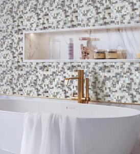
A gray and white mosaic tile mix forms a beautiful feature wall tile (Alma Glamour) design in this neutral, luxury master bathroom.
Nothing beats a classic classic mosaic tile and such is proof in this design. Using a gray and white mosaic tile, the result is a stunning feature wall behind a claw foot tub that’s straight inspiring. With a medley of neutral tile hues and brass accented fixtures, the entire space has an overwhelmingly lux appeal with minimal effort. Plus, the marble niche ties it all together to create a truly one-of-a-kind master bath that genuinely proves neutral interiors are covetable.
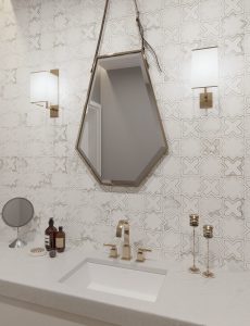
A white stone star and cross backsplash tile (Pantheon White) creates a beautiful design in this powder room.
Our Pantheon White star and cross tile adds a sophisticated statement to this powder room. With a grounding, yet upscale effect, it ties together the beautiful white vanity countertop and the brass decor accents in the space. The white stone adds exquisite natural variation thanks to its patterned floral facade. It provided the perfect way to add a luxe sparkle to this powder room and make an impressive look.
Shimmering, decorative ceramic wall tiles (Atlantis) create a modern industrial chic design in a master bathroom.
With a powerful allure, metallic wall tiles (above) bring a shimmery touch to any interior design with an industrial chic edge. With a slightly worn-in facade, which gives off the look that it’s been exposed to the elements, it stuns. These ceramic tiles can be used to create an upscale contemporary look, and is perfect If you’re looking for a way to spruce up your bathroom floors or walls with a slight edge in an otherwise neutral approved space.
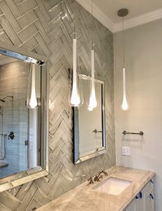
Glass subway tiles (Silver White 3×9) are laid in a herringbone lay pattern to give an individualized touch in this guest bathroom.
This monochromatic tile backsplash gives a slight twist in design by use of a herringbone tile lay pattern. Captivating the eyes with a swirling glass subway tile, this transitional guest bathroom is a balance of chic and functional. The perfect result for a neutral interior that will can be dressed up with home decor elements that suit the rest of the space.
Marble hex tiles (Calacatta Gold Prato) adorn a minimalist bohemian chic bathroom wall.
The beauty of using a marble hex tile as a bathroom backsplash is that it instantly elevates a neutral interior and gives visual interest. Calacatta gold marble gives this tile a warm undertone and natural variation that crafts a truly magnificent wall tile design. What’s more, it adds an organic feeling to this space which shows that yes, even neutral earth tone tiles can create sophisticated designs.
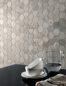
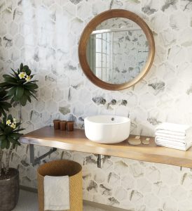
Wood look hex tiles (Timbuktu) craft an unforgettably cozy, gray tone kitchen backsplash design.
Last but in no way least, is this stunner of a kitchen using wooden gray marble hex tiles as a backsplash. With a subdued, soothing yet moody vibe, the kitchen is the right balance of dark and light. The result is a modern minimalist design style that hits neutral interiors with a whole new angle.
If you want even more options for neutral tile interiors, be sure to check out our on-site tile design gallery to keep getting more inspired. If you see something you love, be sure to email: info(at)mir-mosaic(dot)com for more information on purchasing!
Like It? Pin It!